What are some best practices for web accessibility testing?

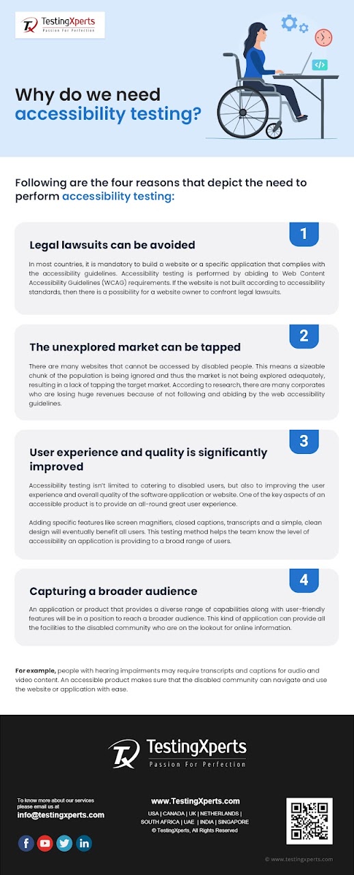
Today’s digital world requires the web and mobile applications that can be used by everyone. The strategic implementation of accessibility testing ensures that web application is accessible to everyone including the disabled community.
This not only gives the medium to reach a wider audience but, also
helps disabled users to browse online information of their interest. In this
article, you will get to know some of the best practices for web accessibility testing.
What
is web accessibility?
It provides a strategic platform that provides protocols and guidelines thereby enabling engineers and designers to create experiences that accommodate users with mobility issues, hearing impairments, cognitive disabilities, blindness, color blindness, low vision etc.
The World Wide Web Consortium (W3C)
is the prime platform responsible for developing web accessibility policies in
collaboration with respective governments.
W3C standards are followed by countries, but, a few countries such as Israel, Canada, US, UK etc., require specific accessibility policies by law.
Following
are the best practices for web accessibility testing:
1.
The orderliness of HTML content: A web page can be scanned by users to find
their needs, while every element must be read by screen readers. Some of the
factors that lead to poor screen reading experiences are lack of labeling, poor
HTML practices etc.
Designers and engineers can work
collaboratively so that the content can be properly structured. For example,
specific mechanisms should be provided to skip over repeated content (i.e.,
header navigation) and links.
2.
Don’t focus exclusively on the color spectrum: If colors are
used by designers, then a second indicator should be included so that visually
impaired users can differentiate content. For example, many message states use
colors and icons for different types, success, warning, errors etc.
Contrast is another key aspect of color.
Visually impaired users take a great deal of help from color contrasting
options as it greatly helps them in reading content. Color issues can be
tackled properly through the strategic usage of specific accessibility tools.
3. Provide a proper structure to text clarity: One of the biggest challenges of visually impaired users is readability. If the web content cannot be read properly, then the website lacks in implementing accessibility guidelines, which in turn can prove to be a hassle for a website’s owner.
The readability (text block clarity) and legibility (letter clarity) should be properly taken care of by the designers. This will in turn make the text content readable and understandable.
Following
are a few simple techniques to enhance the effectiveness of the text clarity:
3.1: A minimum of
16 pixels should be used for body text
3.2: The
responsive/adaptive font sizing should be used in CSS (%, rem, em, etc.) rather
than fixed pixels
3.3: Line spacing
should be at least 150% of the font size or 1.5 times the font size
A comprehensive list is offered by Wikipedia’s “Table of Keyboard Shortcuts” to make the website’s keywords more navigable.
5.
The fundamentals should be properly executed: Most accessibility practices work on UI
design fundamentals and UX principles. Architecture, navigation, clear and
logical designs are deemed to be important. If these basic yet important
aspects are ignored by designers then there will be accessibility and usability
issues.
About the author: I am a technical content writer
focused on writing technology specific articles. I strive to provide
well-researched information on the leading market savvy technologies.

Comments
Post a Comment